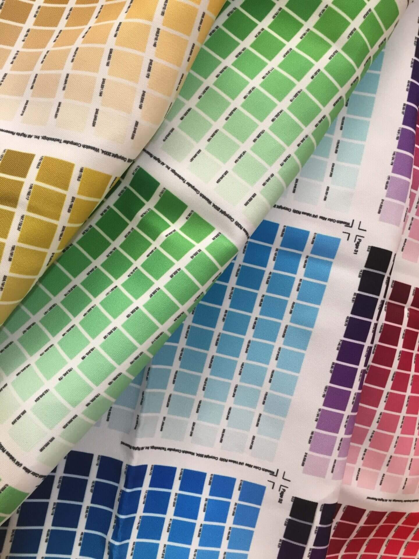
How do colours affect purchases?
Colour and Branding
Colour increases brand recognition by 80%. Why is this important? If we recognise a brand we instantly
connect with their values thus increasing consumer confidence and a quicker purchasing decision.
BOOM! Do you still think colours have no impact?
Intelligence, Light, Organisation
Yellow is the colour most visible to the human eye. Yellow is not a colour associated with luxurious items and can often be seen as childish.
Energy, Strength, Passion.
Red evokes feelings of urgency because it is often associated with discount sales. Use red sparingly it can be an annoying colour if used on vast amounts of space.
Good fortune, Communication, Wisdom.
Blue is often used within corporate companies because of its calming and trusting effects. It is suited to websites selling technology,
medication and water based products.
Earth mother, physical healing, monetary success.
Green is mostly associated with eco products and would suit sites selling healthy and natural or organic products.
Warmth, energy, flamboyancy.
Orange is an appetite stimulant (think of juicy oranges). It is seen as a young fresh vibrant colour. Used to encourage e-mail sign ups.
Truth, friendship, love.
Different tones of pink can represent different emotions. Vibrant pink is associated with energy whilst pale pink is sweetness and love. Used to market feminine products.
Power, sophistication, dramatic.
Used to market luxurious and sleek goods. Can be depressing if used over large areas.
High aspirations, royalty, spirituality.
Bright purple is effective for promotion of children’s products and also beauty
products.
Which colour grabs your attention the most?
Which colour would grab your target markets attention? If you don’t know perhaps a little market research is in order.
Appropriate colours
Do you remember The Apprentice, Week 6? The task was to produce a cleaning product for the kitchen. Here is where appropriate colour comes into play.
This is what they produced – A black and red bottle?!
Does that represent a clean, fresh and harmless cleaning product for your kitchen? NO, it looks like its full of harmful irritants, I wouldn’t want to use that on my surfaces.
Be aware of how your website could come across based on the colours you have used.
If you want to use red why not take it down a few shades to make it easier on the eye.


