
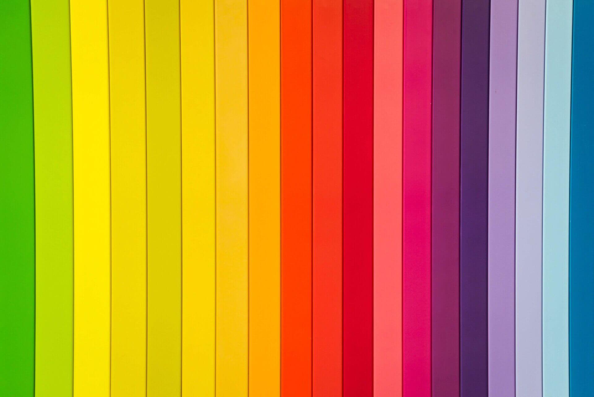
We are all familiar with the power of colours: Colours convey messages, evoke emotions and add brilliance to everyday things. As a result, colour plays a big part in logos. A logo wants to grab your attention away from other logos, and say “look at me!”. This is communicated through the use of form and shape, but most importantly colour.
We have had a look at what some colours convey, and how they can be used to portray the and strengthen brand image.
-
Yellow is Optimistic!
It is easy to understand why yellow evoke feelings like optimism, clarity and warmth. It is a rich colour. One of the perks of yellow is because it is so bright, it can stand out even when it is in busy surroundings. This colour is commonly found to be used with brands that want to put a smile on your face.
-
Orange Doesn’t Hold Back!
“I’m not afraid to be the centre of attention” is the message that orange sends out. Orange is a colour that doesn’t let anyone pass without taking a look, it stands out in the crowd.
-
Red Raises the Energy Level!
Have you ever noticed that you pules rates has rose while looking or been exposed to the colour red? It is scientifically proven that red can actually increase peoples pulse rates when they look at it. It is a warm, exciting, sexy and urgent colour, that is bold and romantic.
-
Purple Sparks the Imagination!
Purple is the colour of royalty. It conveys the images of grandeur, opulence, and mysticism. The reason why brands harness purple is because of its regal, “anything is possible” vibe and it draws in customers who are looking for an experience that is a step away from the ordinary.
-
Blue is the Hue of Dependability!
Blue is a calming colour, and it conveys a feeling of strength, dependability and tranquillity.
-
Green Is for Growth!
The key message that green conveys is peaceful and growth. It may not come as a surprise that green is associated with and used in the context of the environment, and maybe in particular being environmentally friendly.
-
Black and White is simple and elegant.
In the world of graphic design, black and white is not colours. Black is the absence of colour and white is a combination of all colours. Putting technicalities aside, black and white, make for striking logos. Black is edgy while white is clean and pure, and by using them together makes for a logo that is timeless and beautiful. For example, Nike and Puma use black for an edgy vibe, while newspapers and other publications use black and white for the combinations balance and simplicity.