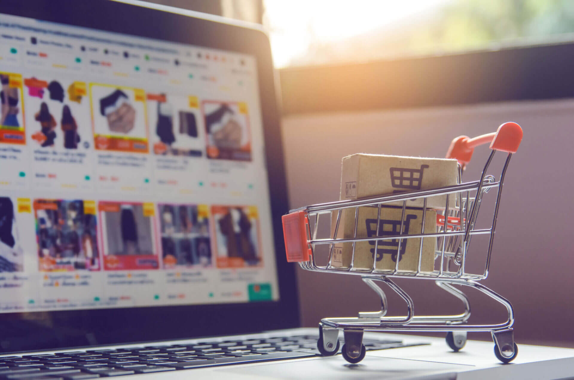
Your E-commerce website is your virtual shop, it must greet people with a warm welcome, show them exactly what is on offer and be easy to navigate. It needs to convert online visitors into paying customers, especially if you are selling solely online. Here are our tips for designing a brilliant e-commerce site:
Navigation
It’s important that a visitor to you site can find what they are looking for, whether that be your products, contact information or information on your company.
Navigation bar: A navigation bar gives visitors all page links in one place, simplifying their search and hopefully making their shop as stress free as possible. A search bar is always a useful addition!
Information: your contact info, company, product and payment details… Some customers may want to know more about you and what they are buying before they click pay. If they cannot find this, it may result in a lost customer.
Graphics
An outdated, plain or messy site will give visitors a bad impression straight away. Elegant graphics, professional photographs and a sleek layout tell a visitor that this company is stylish and care about how they look. It shows your love for your product if you display it well. We are all very visual, it is important to remember this!
Photo galleries on your home page give visitors a glimpse of you products straight away. Great graphics show you have spent time and money on your site and implies you do the same with your products. A sleek, simple layout will then make it all fit together perfectly.
Your brand ideal and feel should run throughout your site, through the colours and graphics you choose.
Story
We are all nosy! We want to know about the faces behind these products, so tell us who you are!
An about us page gives visitors a sneak behind closed doors, it makes you seem more tangible and less like just another online store.
Top tip: Make it a fun story or quick history of your business and it will stick in their memory!
Blog
A blog gives a customer more of an insight into your company, what you are up to and what you care about. It can also include business advice and is something great to link to your social media and promote your products.
Posts don’t have to be journalistic masterpieces, just well written and informative pieces on topics linked to your company and themes that interest you.
Getting in contact
It’s important that customers can get in contact if they have an issue or question.
Your address, email address and phone number should be on your site as well as clear links to social media.
Twitter, Facebook, LinkedIn and any other social media sites will bring in customers and remind them of your products, inform them of any new ranges and changes.
Sign ups: a sign up box for your newsletter is always a great addition and something that can help promote your business.
We have found 5 examples of e-commerce sites we believe show these qualities well:
JM and Sons

Who are they: They are a furniture makers in Toronto, Canada.
Why we like their site:
The navigation bar is clear, graphics and imagery are sleek and give a great insight into the company. Their story and blog show a friendly company that cares deeply about their business and the furniture they produce.
Press releases show where they are being advertised, showing customers this is a fashionable and promotable business.
Best bit: They offer to send out wood samples to anyone who asks, a free sample is always a great promotion and an example of the wood they us will give customers and impression of what to expect, a great idea!
Purefix cycles

Who are they: A bicycle company
Why we like their site:
It’s clear what they sell from the images on their home page, pictures of bikes are everywhere! But the layout is tasteful and simple, their products are not splashed everywhere. The navigation bar is clear and the pages you want are visible and their phone number is written on the permanent top bar.
Sign up and social media are easily seen and the about me and blog give you a understanding into the company and their values.
Best bit: The links to product ranges have interesting names eg Glow. Catchy and concise!
DENY designs

Who are they: An online store selling uniquely designed home furnishings and general accessories.
Why we like their site: It is easy to navigate, with a clear bar at the top complete with every link you need and a navigation bar that stays at the top of every page. Their phone number also stays at the bottom, along with other information.
The graphics are bold and bright and represent their company and products perfectly. The pictures on the home page change continuously and they have new products and products recently shown in magazines on the page.
Their about us page is well written and friendly and the ‘designs they love’ sections show their love for their own company.
Best bit: The DENY design logo changes colour when you hover over it, a fun addition!
Kutoa

Who are they: A fairtrade company selling health bars to raise money for third world companies.
Why we like their site: It is obvious from the home page what their cause is and this runs throughout the site. The site is simple, giving you the information you need and nothing more, making it easy to use!
The navigation has few links, but enough to give you what you need. Social media links are obvious, as well as contact information and the story behind the company.
Their branding runs throughout, on their products and on their pages, pulling it all
Payment accepted is shown at the bottom of the screen at all times.
Best bit: The subscription bar stays on the screen at all times and a discount tab can be seen at the side, enticing customers in.
Au Lit Fine Linens

Who are they: A linen company
The navigation bar is simple and has all the links you need in plain view. The colours they have used are sleek and serene, reflecting their linen.
The pictures on the home page reflect the colours used in their graphics, bringing their brand, products and design together seamlessly.
Best bit: The subscription wording- ‘become a VIP when you subscribe’ makes customers feel special and not like they are signing up to merely receive useless emails.